SOLBEN is a Mexican biodiesel company recognized by Forbes for its high impact in the energy sector. Founded in 2007, with the aim of generating national technology to create solutions for the processing of raw materials on biofuels. Today the company has 18 biodiesel plants in 13 states of Mexico and in various Latin American countries such as Bolivia, Argentina, El Salvador, Nicaragua and Colombia.

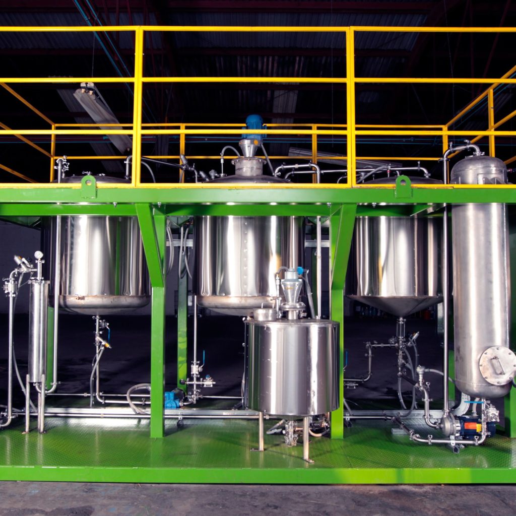
The project consisted on the branding redesign for SOLBEN, who sells its patented technology to private companies to transform its organic waste into fuel.
The new branding was revealed to more than 200,000 people in the most important entrepreneurship event in Mexico, “La Semana Nacional del Emprendedor”.
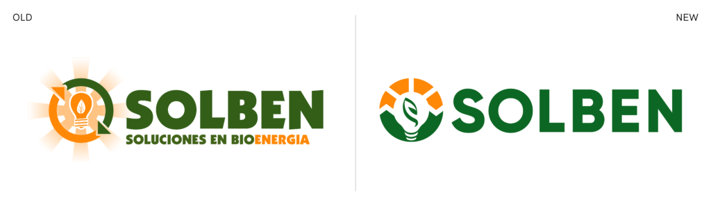
The biggest challenge for this redesign was to preserve the original icons but give them an innovative and modern approach.
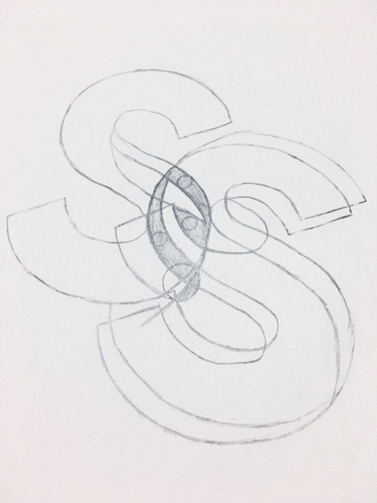
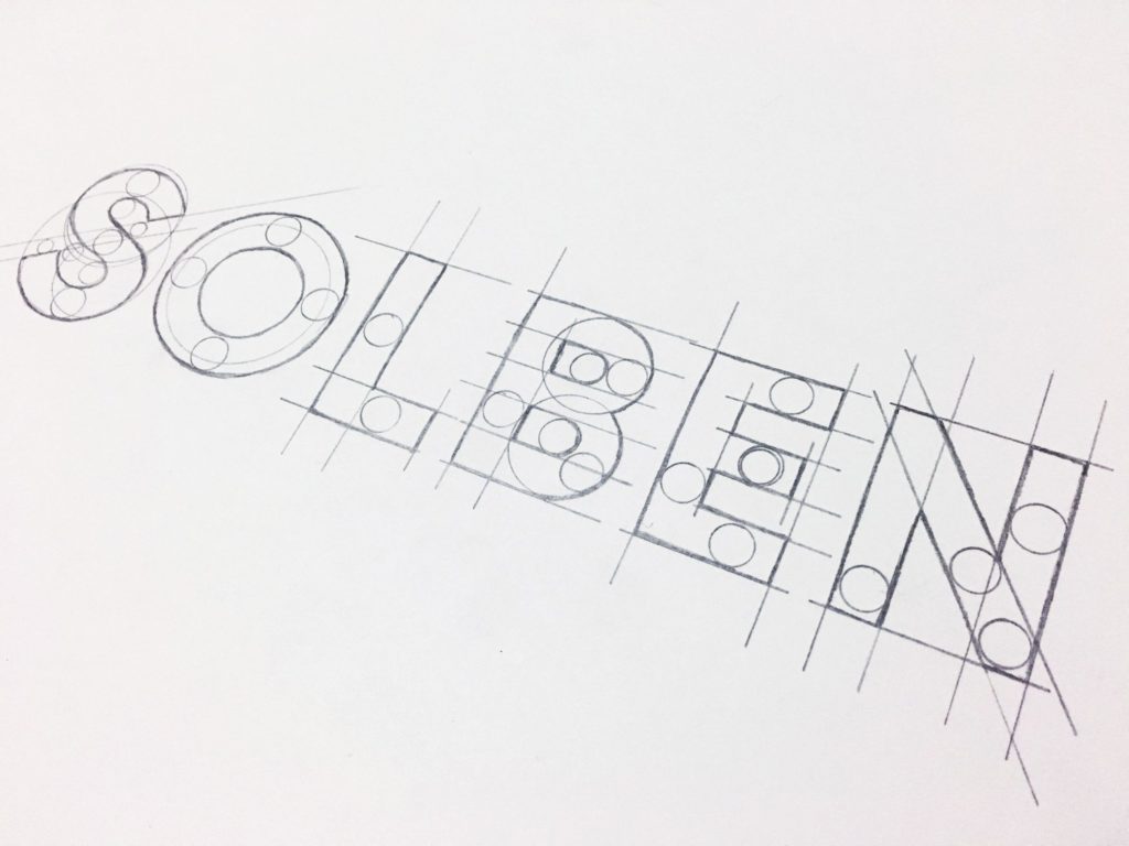
The result is an iconic logo filled with organic forms and instantly memorable: a lowercase “s” built from the initial “SOLBEN” that emulates the shape of a leaf inside the silhouette of a lightbulb as an element of energy, which in turn is wrapped in the abstraction of the recycling arrows along with some rays of sun.
Following the modern line a Sans-serif typeface was chosen to accompany.
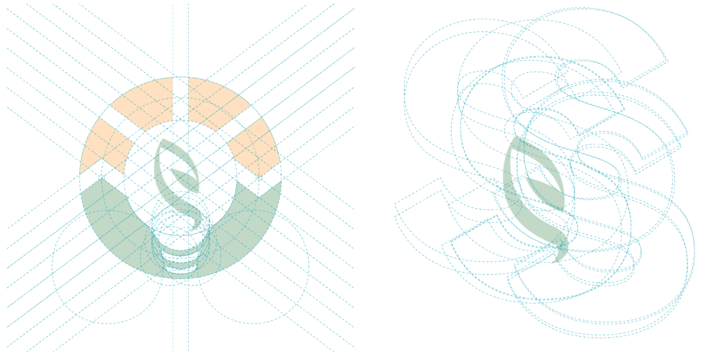

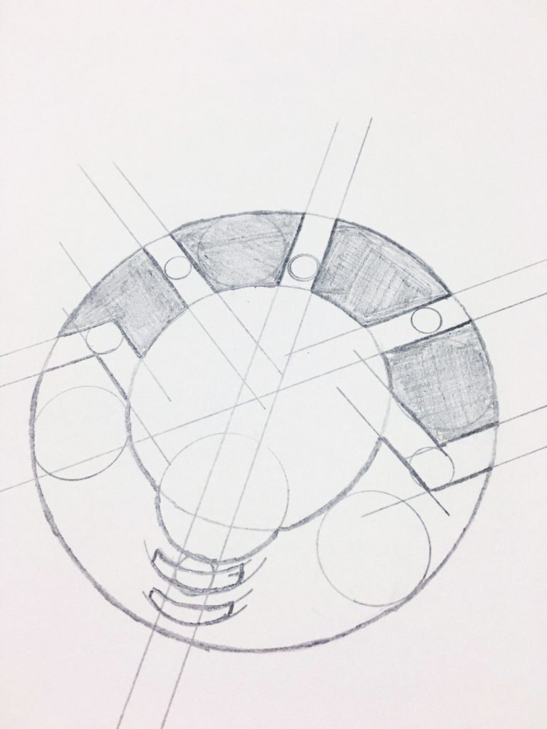
Every stroke of the icon was plotted individually following the mathematical relationship of the golden ratio to create a visual harmony.
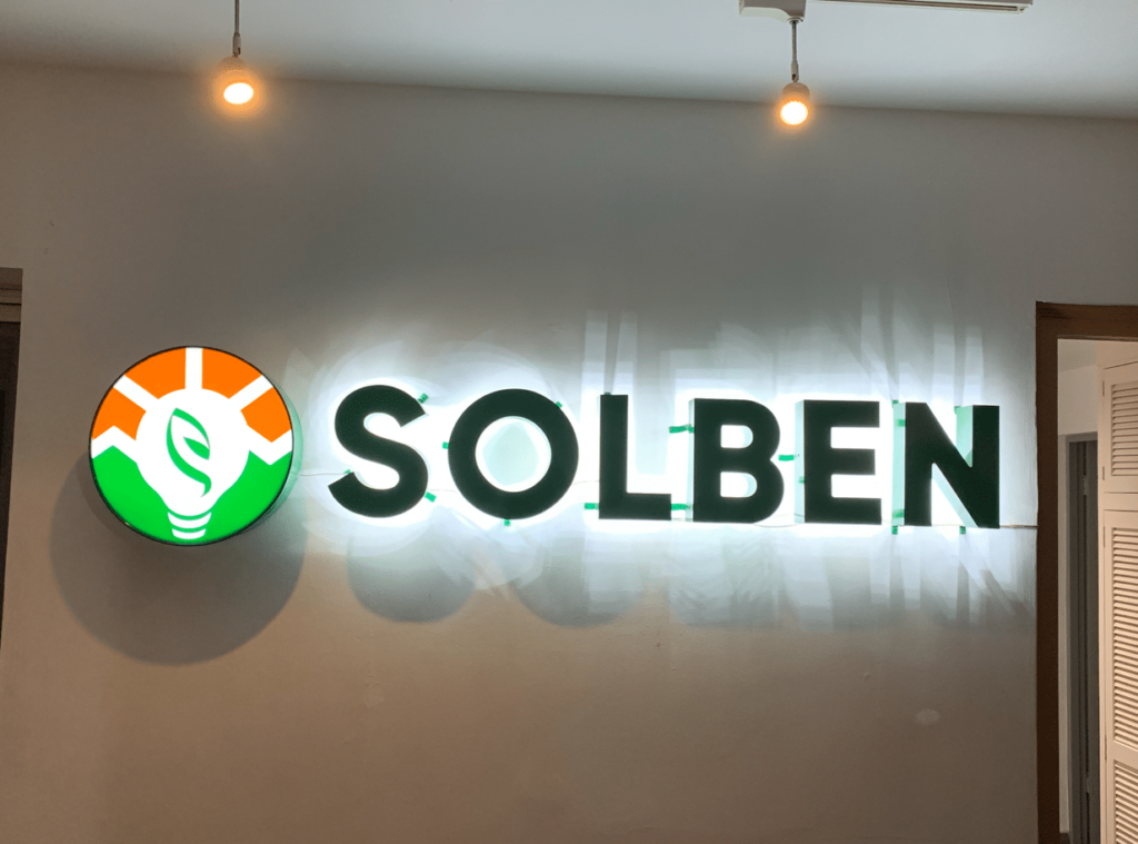
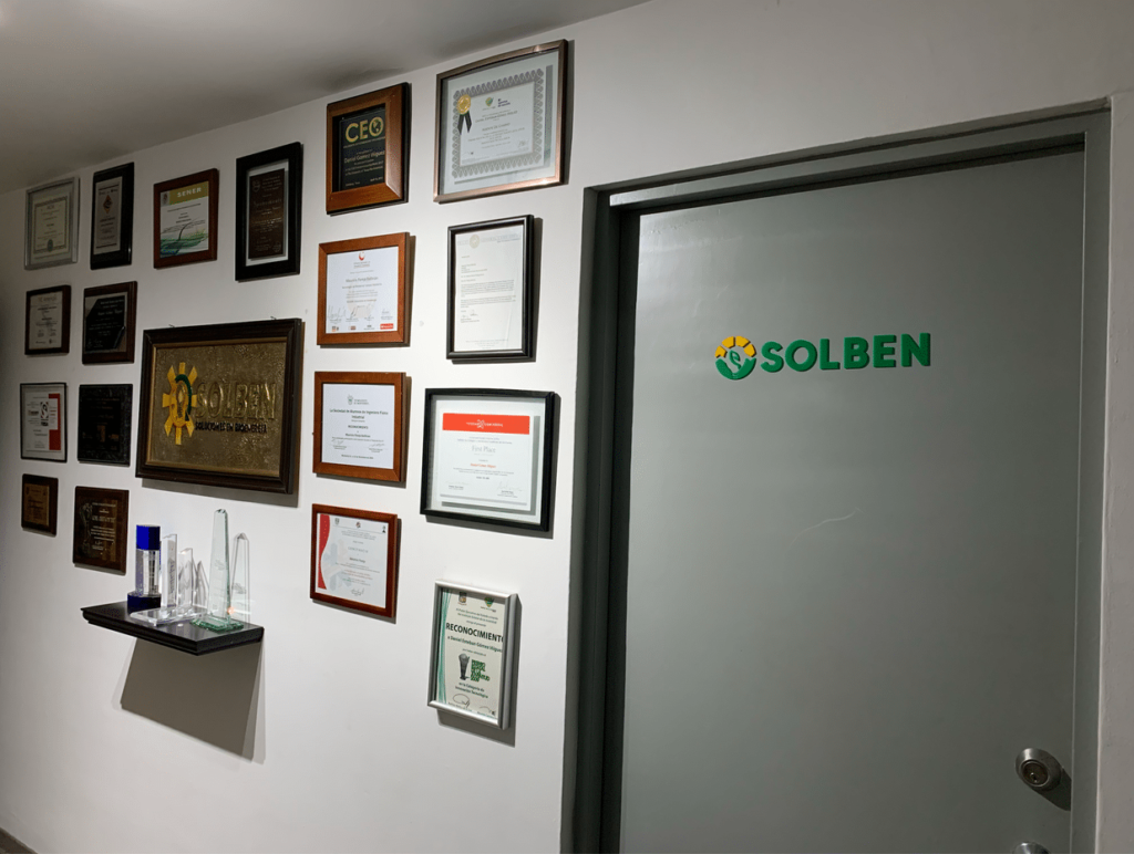
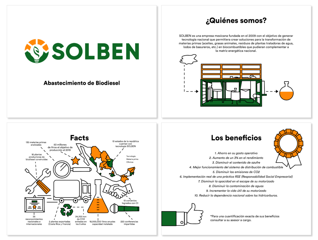
These are some real life examples of applications that has had the rebrand of SOLBEN.