Novartis is a global healthcare company based in Switzerland that provides solutions to address the evolving needs of patients worldwide. Their Innovative Medicines Division commercializes innovative patented medicines to enhance health outcomes for patients and healthcare professionals.
Novartis’s Challenge:
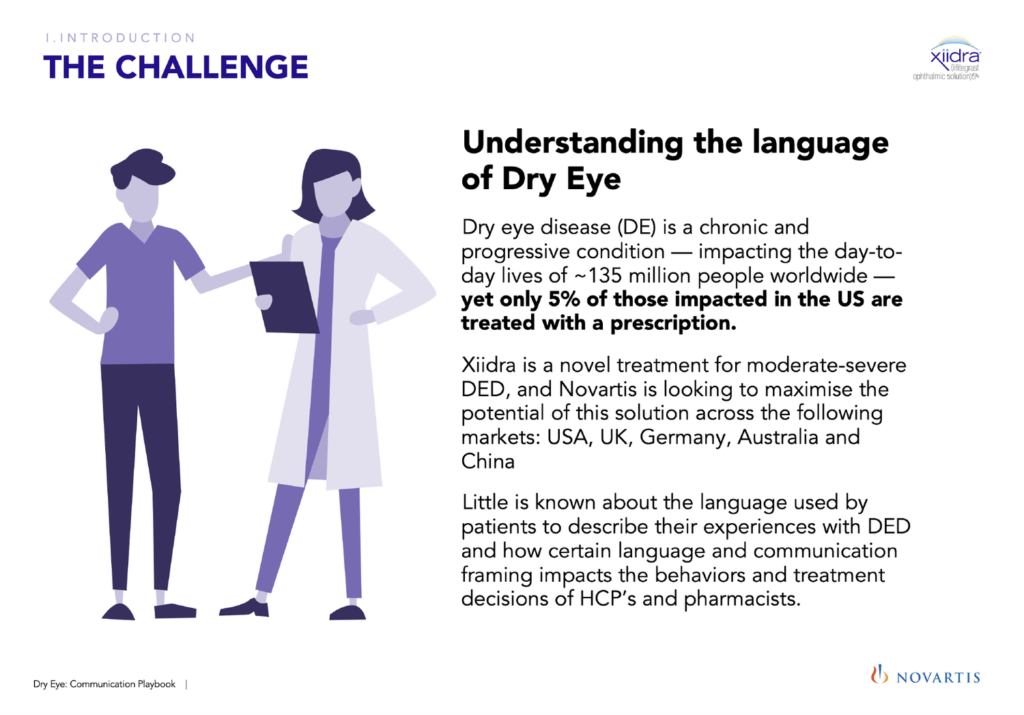
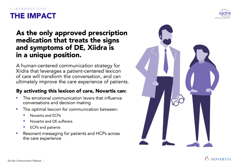
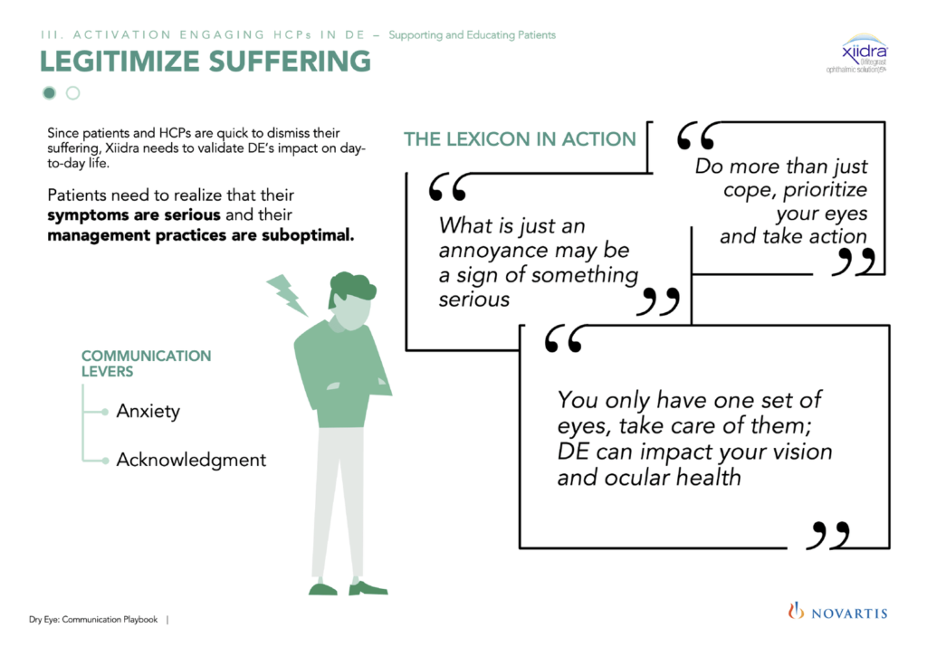
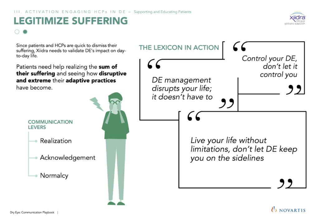
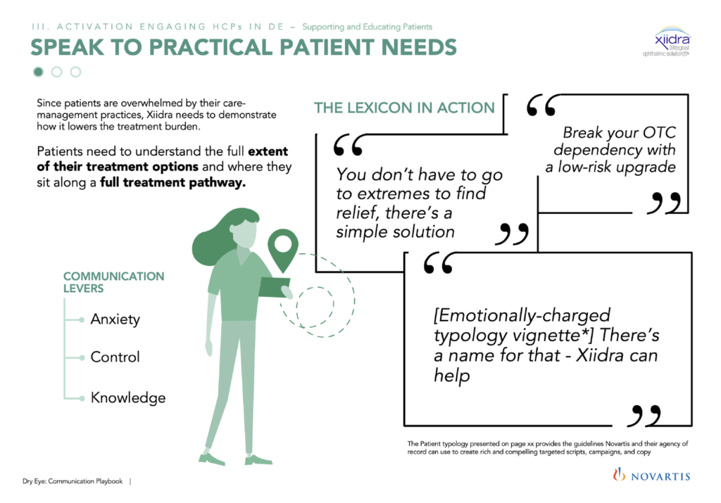
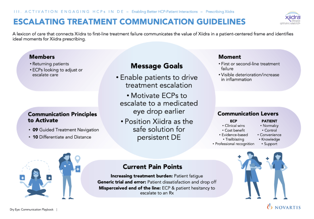
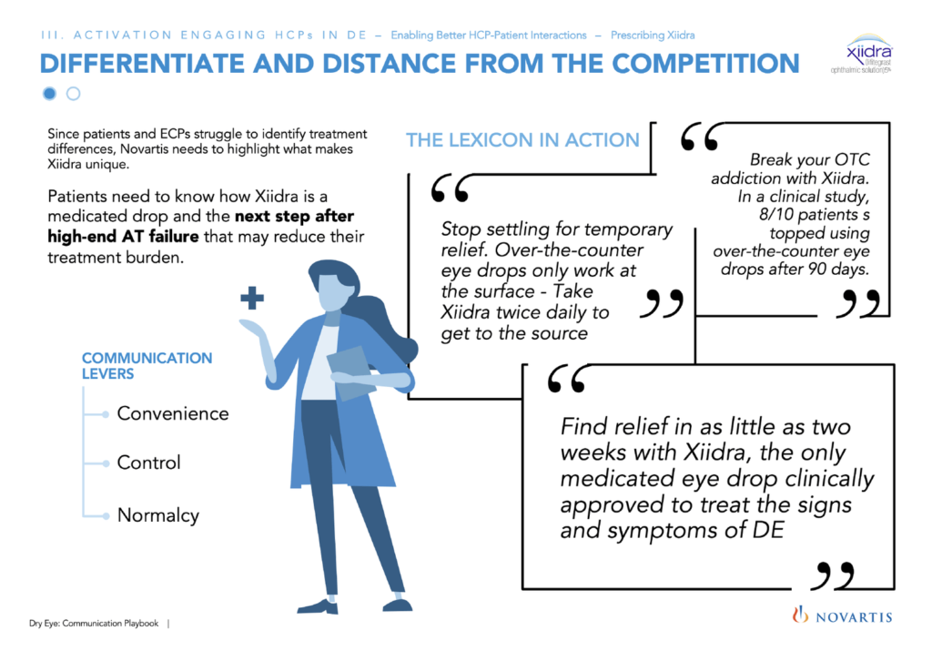
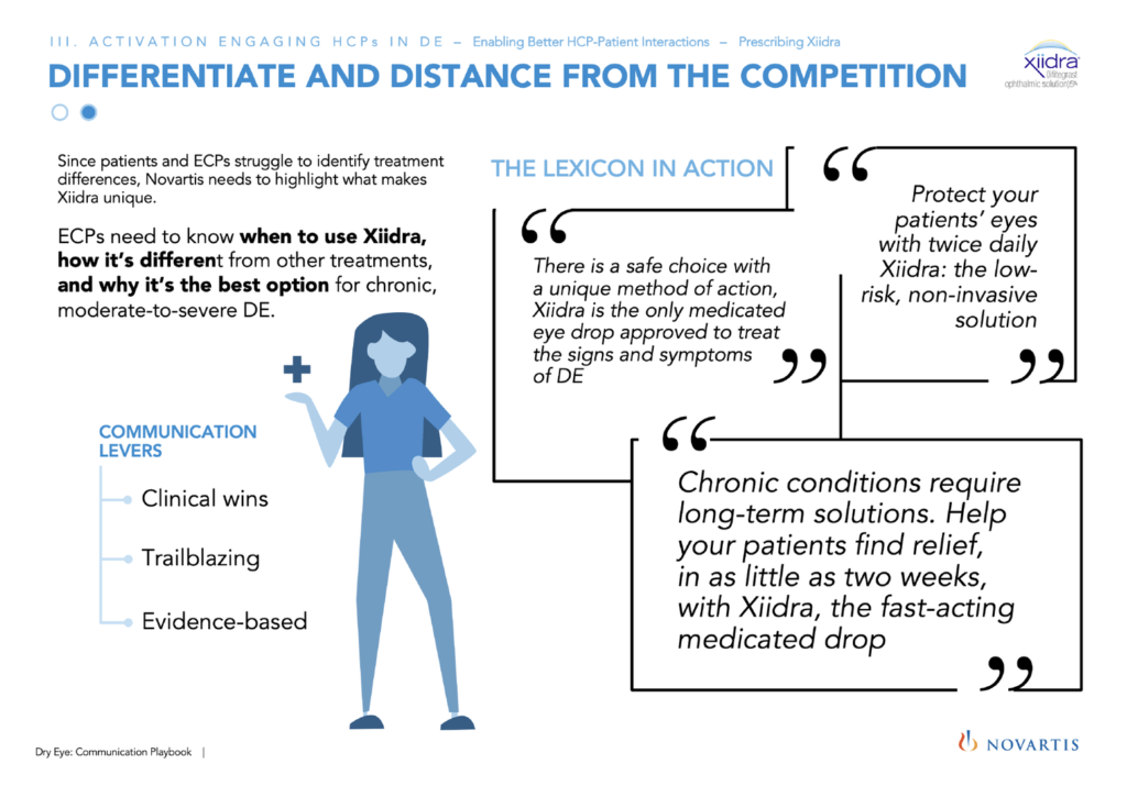
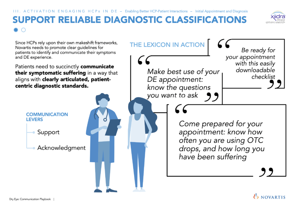
Dry eye disease (DED) is a common and challenging condition—impacting the day-to-day lives of ~135 million people worldwide who suffer from it. Little is known about the language used by patients to describe their experiences with DED and how certain language and framing impacts the behaviors and treatment decisions of ECPs and pharmacists. Xiidra is Novartis’s treatment for moderate to severe DE and Novartis
Design solution:
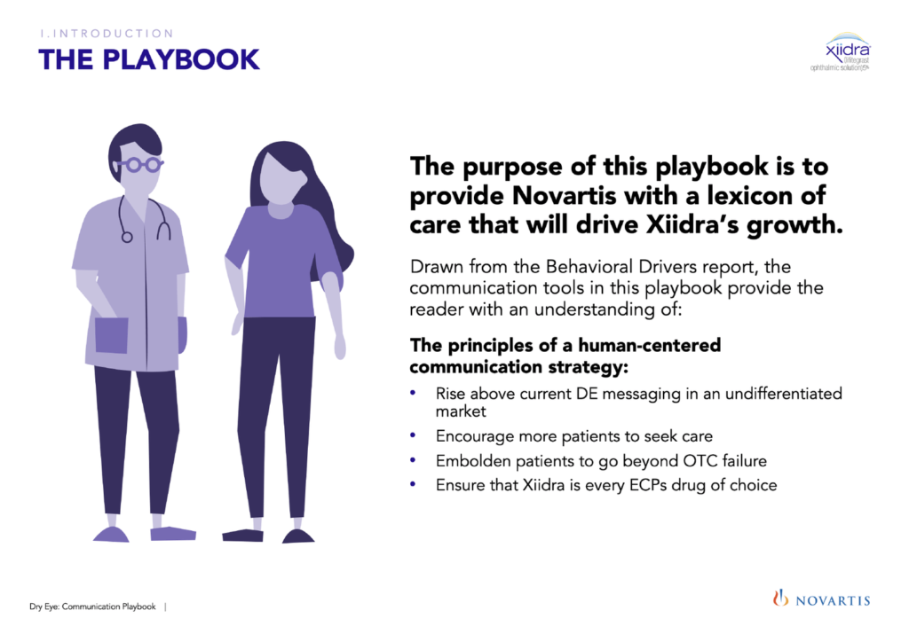
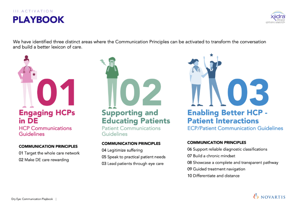
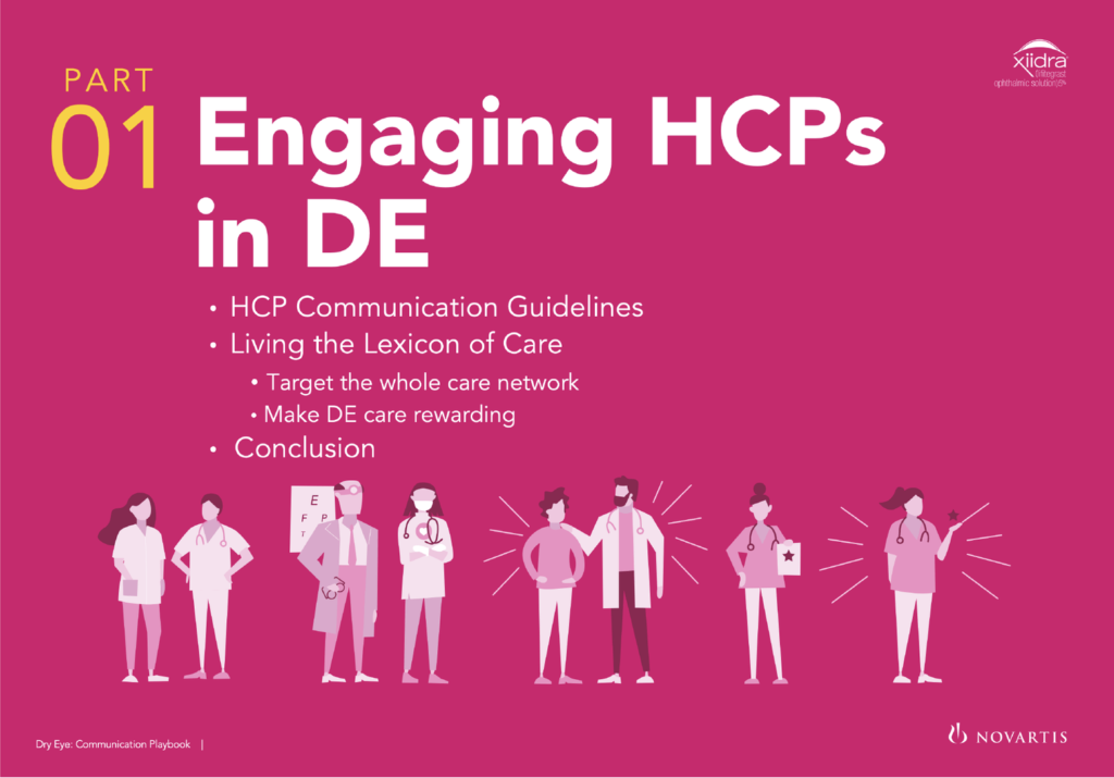
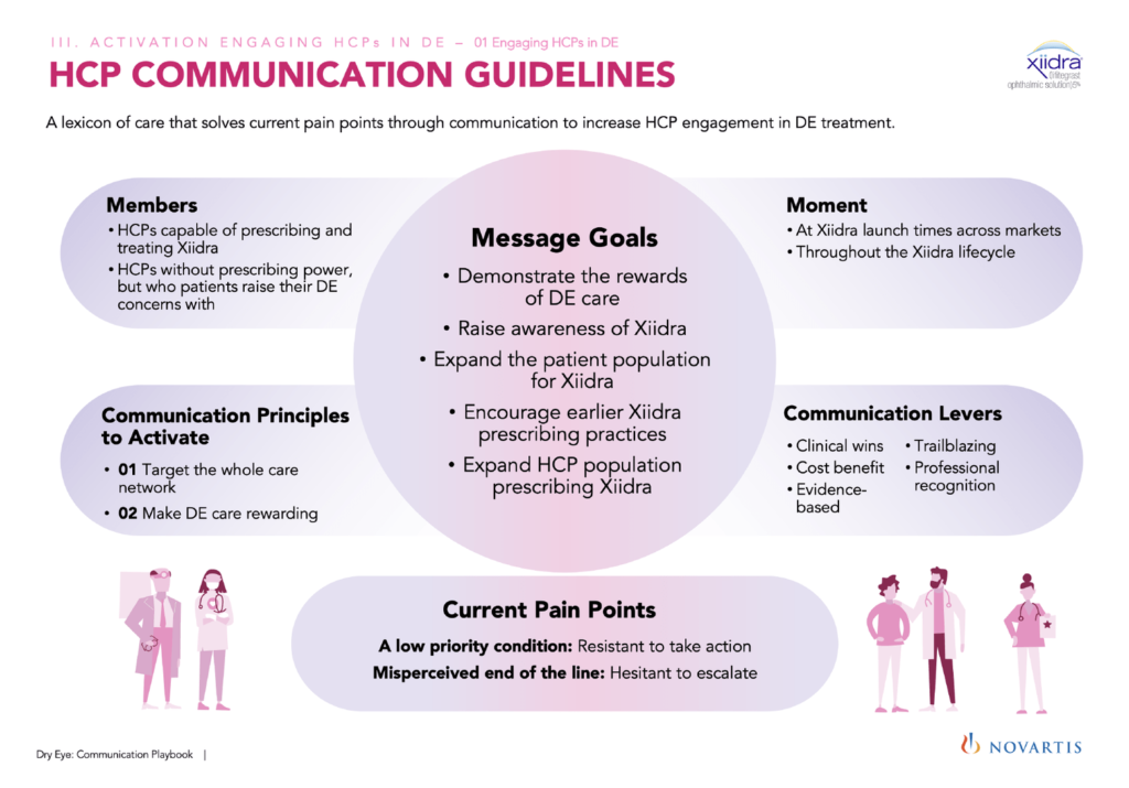
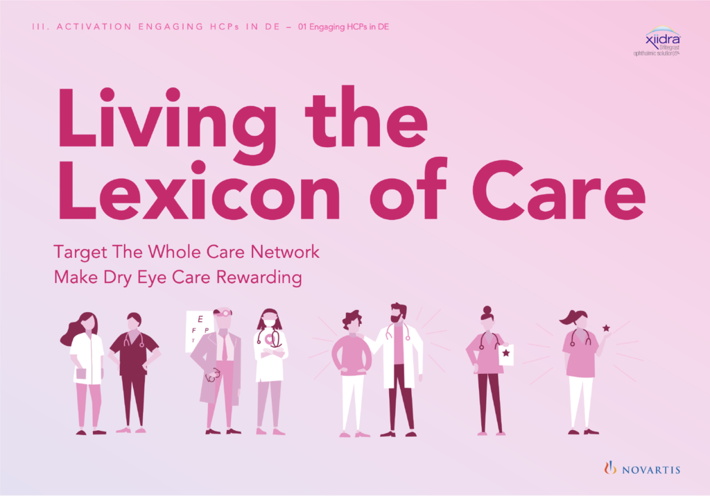
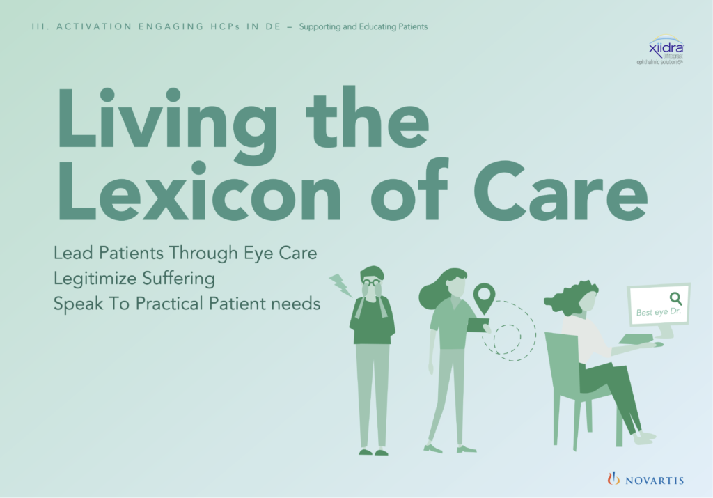
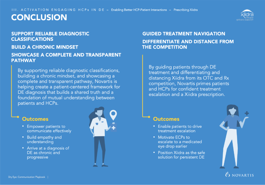
Design a communications manual to be used regularly by the wide variety of Novartis (Xiidra) marketing teams to guide their language, tone and messaging around the drug Xiidra, when briefing their advertising agencies.
The majority of the playbook will be USA focused, but will need to accommodate the other 4 markets’ information too.
Effective color coding/ Color coding the design system
Color was used to identify different sections of information. Since the document has many pages of content that could be organized into specific sections (subjects, chapters, sub-sections, etc), color was used to give each area a specific look. Each section may take on its own type of branding.
Differentiating sections by color helps users understand where they are in the navigation. Over time, as they become exposed to the colors, they’ll develop a mental map for where different sections of content live.
Tools used for easy edit
The documents were designed in power point at the request of the client so that it would be easier for them to edit them once the project was finished.
Style is:
– Quick and easy to access, navigate and read
– Easy to print and share relevant sections
– Highly visual as well as using clear relevant text sections with infographics and illustrations
– Clear in section breaks
Inclusive illustrations
I designed included illustrations to accompany the document.
In some illustrations, we show full-bodied meeples interacting with larger-than-life environments.
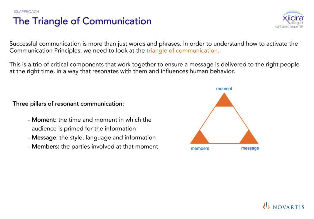
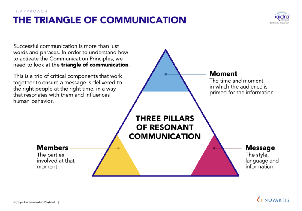
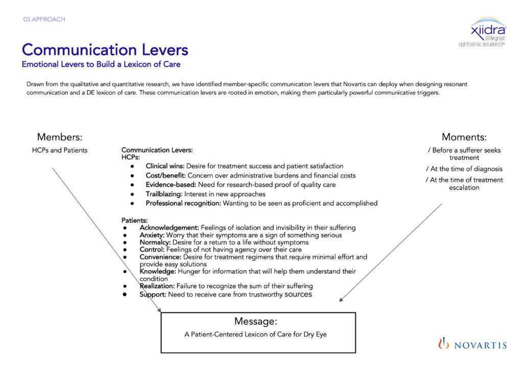
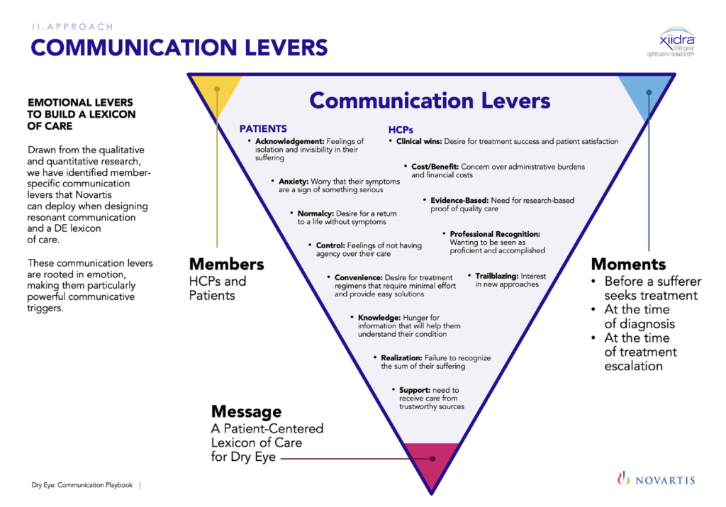
Information Visualization – Before & After
On the left side we can see how the information was before it was redesigned. The right side is the after, already with the visual treatment applied to improve its readability.
Enhance the essential
It is helpful to use the title to convey the crux of the viz and remove any irrelevant grids, labels and bright colors. You can also use reference lines and text to draw attention to specific points.
Use patterns
You may display similar types of information like one with the help of patterns. You may establish a pattern by using similar chart types, colors, or any other element.
Incorporate interactivity
You may deploy data visualization tools that infuse interactivity into your graphs or charts. However, ensure that this does not confuse the target audience since the main purpose is to clarify doubts or queries.
Infographics: Unlike a single data visualization, infographics take an extensive collection of information and gives you a comprehensive visual representation. An infographic is excellent for exploring complex and highly-subjective topics.