Incyte is a global biopharmaceutical and Fortune 500 company that focuses on the develop and manufacture of prescription biopharmaceutical medications in multiple therapeutic areas including oncology, inflammation, and autoimmunity.
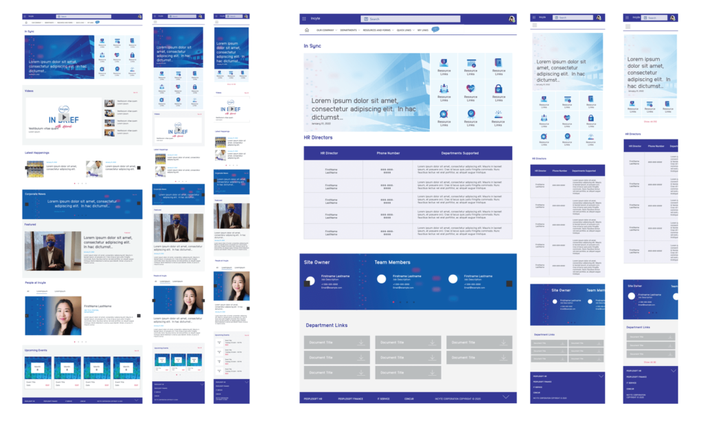
In 2021 I worked as an Art Director redesigning its Sharepoint Intranet page, for the web, tablet and mobile version. This site is used for internal communication, announcing upcoming company events, blogs, news and relevant articles written by employees.
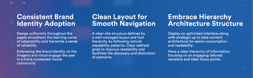
I redesigned the most applicable components on the site and created prototypes for the Home Page, Human Resources, Human Resources Japan and Incyte Involved section.
Moodboard
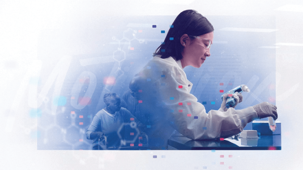
I was a looking for a bold, sophisticated and fresh look as the main concepts to communicate with the redesign of the Sharepoint site. As a result, the design is sleek and stylish. With bold accents of branded colors and vibrant duotones to that will unify the style of the images, catch user’s attention and guide them over strategic focus points on their navigation.
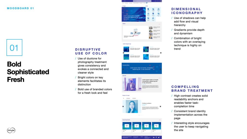
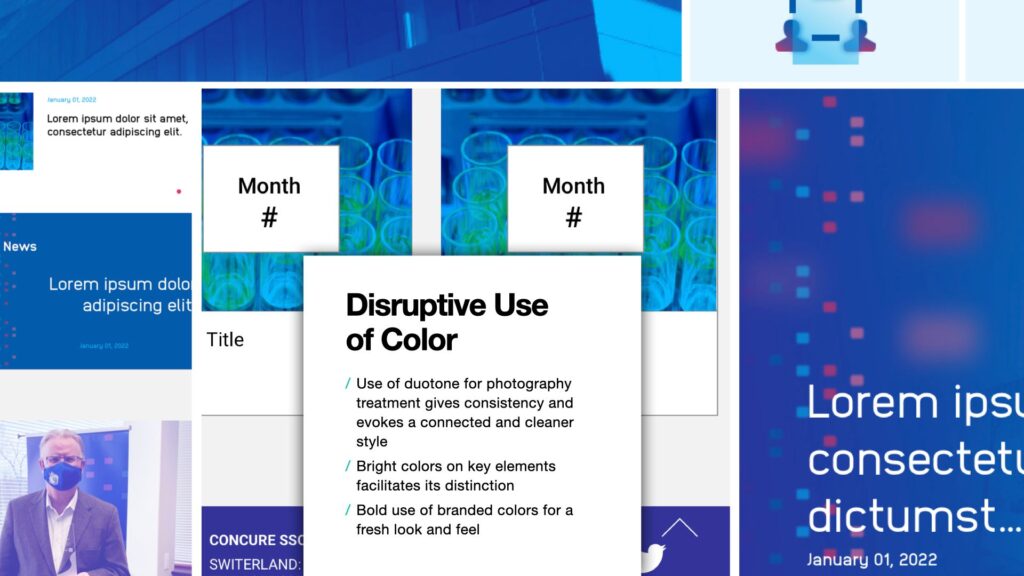
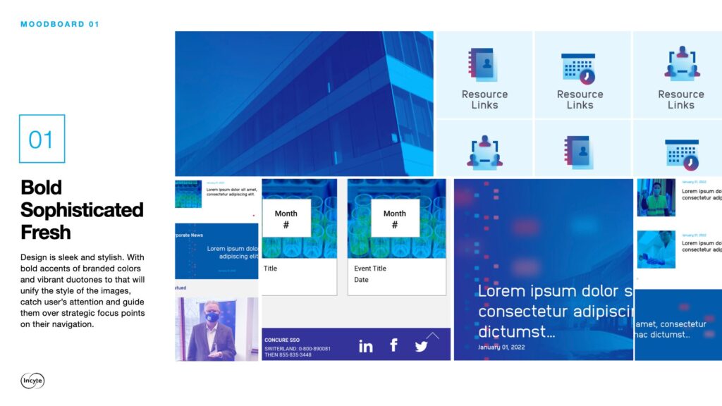
Disruptive use of color
- Use of duotone for photography treatment gives consistency and evokes a connected and cleaner style
- Bright colors on key elements facilitates its distinction
- Bold use of branded colors for a fresh look and feel
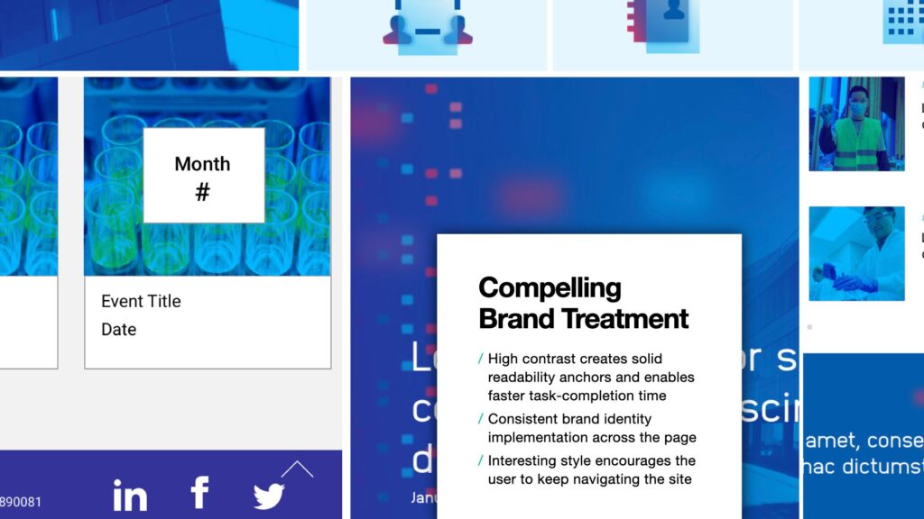
Compelling Brand Treatment
- High contrast creates solid readability anchors and enables faster task-completion time
- Consistent brand identity implementation across the page
- Interesting style encourages the user to keep navigating the site
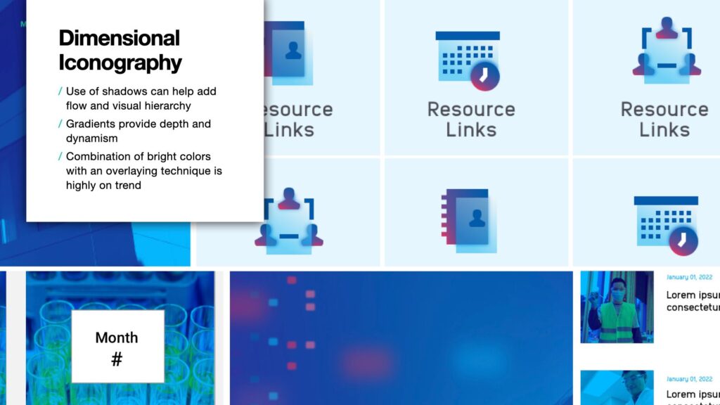
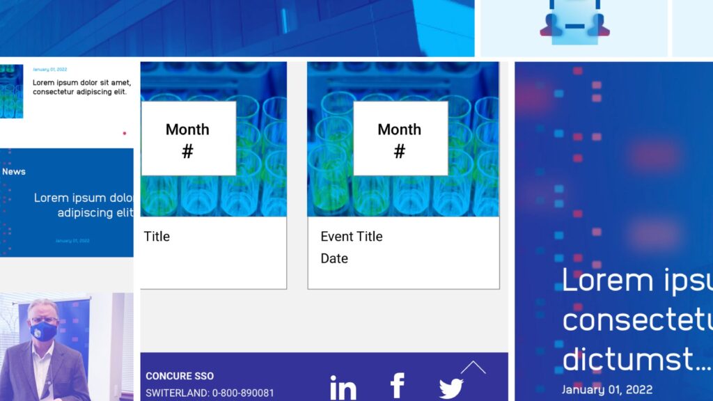
Dimensional Iconography
Along with this, I designed a complete collection of over 100 icons with the most used concepts within the site. As part of the deliverable, these icons have also been made off to the client in .svg format so that they can be used as visual tools in other materials such as decks, brouchres and one pagers.
- Use of shadows can help add flow and visual hierarchy
- Gradients provide depth and dynamism
- Combination of bright colors with an overlaying technique is highly on trend
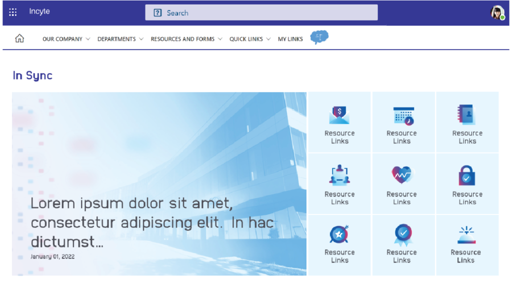
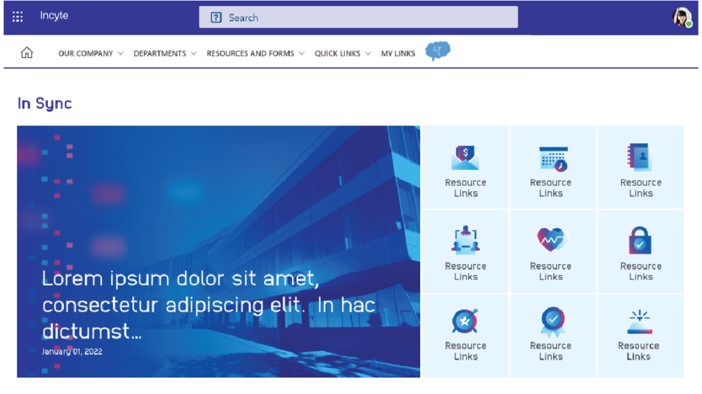
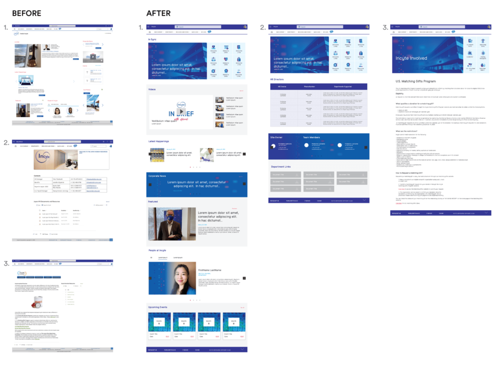
Before and After
Incyte’s Sharepoint intranet BEFORE on the left, AFTER on the right.
This platform is constantly updated by various internal editors, that is why the site lacked aesthetic uniformity or a correct use of the brand’s visual guidelines, so there was a need to also uniform that and provide easy-use templates for a further development.
The visual hierarchy of the site was also modified to provide users with a better experience and to facilitate their navigation.
One of the constraints of the project was the lack of flexibility from the Sharepoint platform regarding the possibilities of edits for the components. However, the end result was effective and high-impact.
Incyte Sharepoint Redesign Takeaways