Molina Healthcare is a Fortune 500, multi-state health care organization operating for more than 30 years now. Their locally-operated health plans serve approximately 2.3 million members in 11 states. Molina also offers health information management and business process outsourcing solutions for state Medicaid programs through its subsidiary, Molina Medicaid Solutions (MMS).
For this project, I worked with a multidisciplinary team to redesign their Marketplace site. Due to the Covid19 pandemic, the client had the need to update their platform and stay current with the competition.
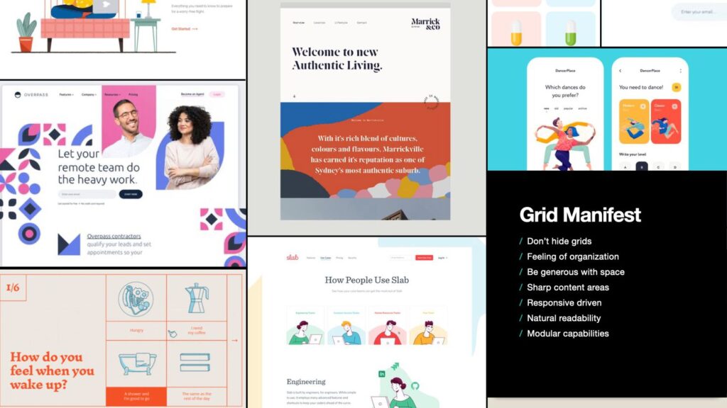
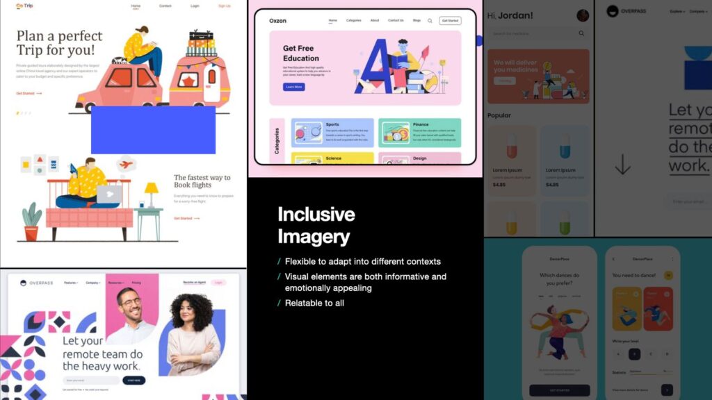
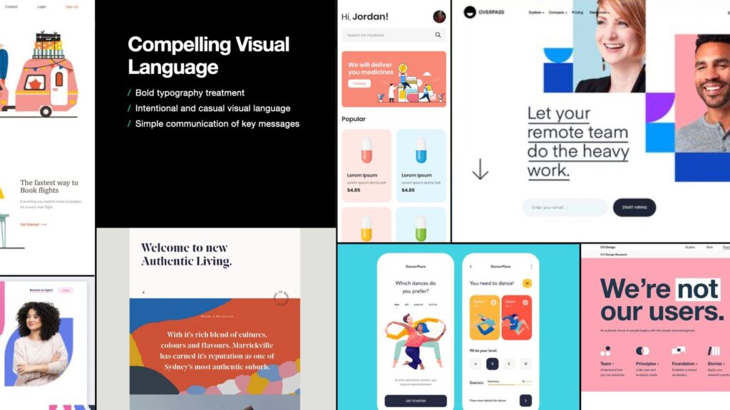
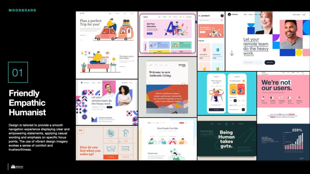
Moodboard
Molina Healthcare wants to reimagine how their digital platforms communicate its wide offering scope of possibilities. Being consistent in brand terms and transmitting that empowerment to the customers by making them feel in control and guiding them over the content.
Design is tailored to provide a smooth navigation experience displaying clear and empowering statements, applying casual wording and emphasis on specific focus points. The use of vibrant design imagery evokes a sense of comfort and trustworthiness.
The key elements that inspired the design are the concepts: Friendly, Empathic and Humanist.
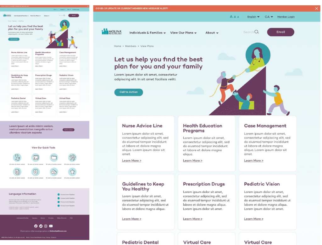
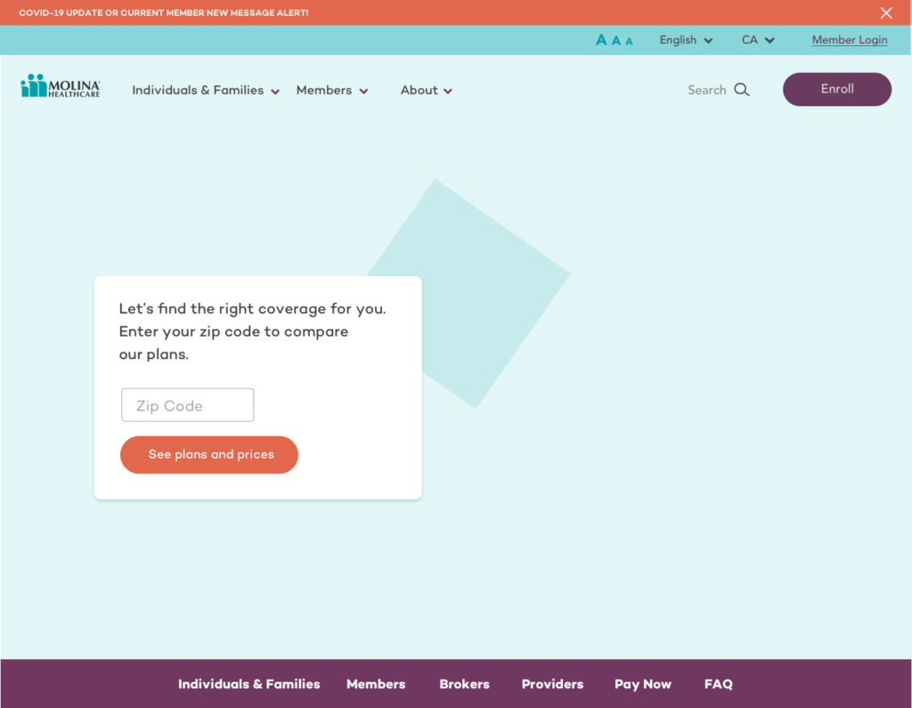
Landing Page
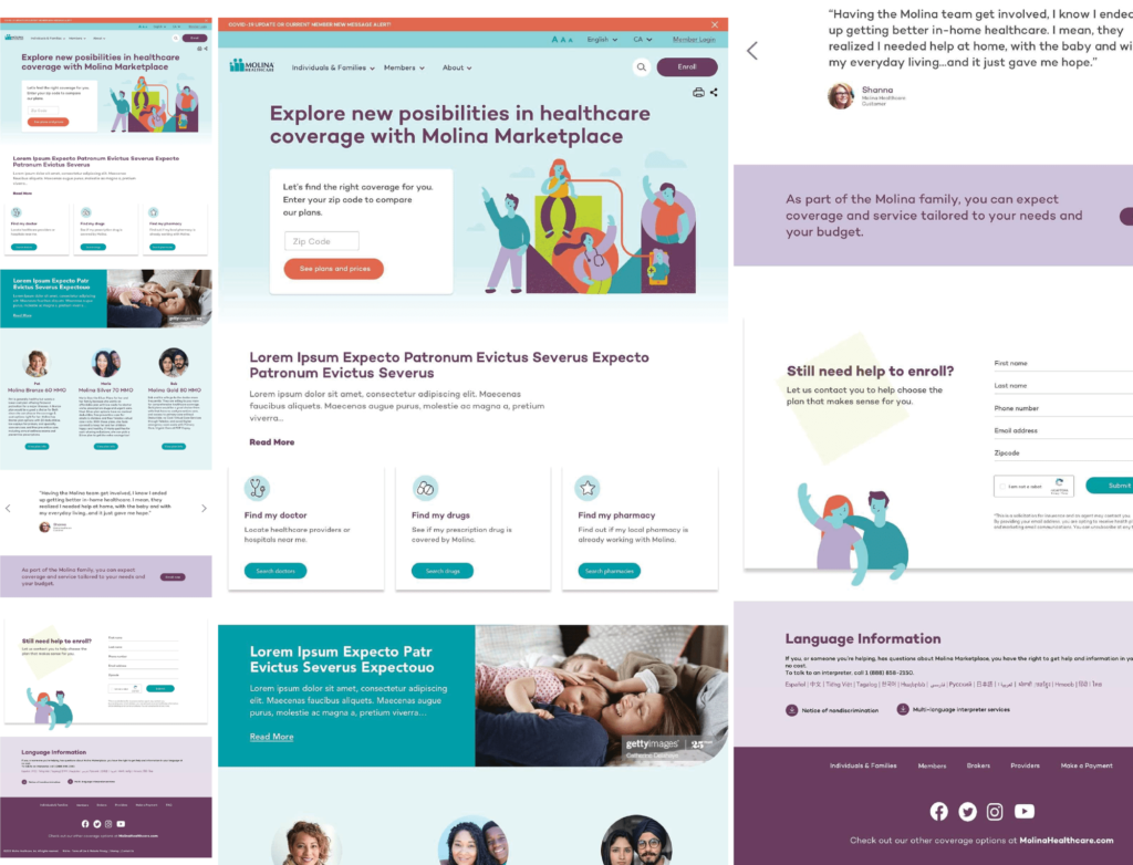

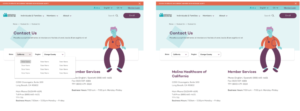
Landing page communication is designed to target new potential users, instead of becoming a dashboard that also speaks to existing users and providers. With a clear site structure, a well managed layout and font hierarchy by following natural readability patterns.
Site is aligned to the brand identity and creates consistency across the site to transmit a sense of familiarity, comfort, control and reliability. It also facilitates its adoption by simplifying the interface navigation.
- Efficient scannable layouts enables the identification of relevant content to the user and helps them achieve faster task-completion times.
- A proper amount and strategically use of negative (white) space can bring focus to the most common UI elements, emphasizing the content provided and guiding the user in its navigation.

Intuitive navigation across the site, reducing cognitive workflow through organized content structure display and consistent design patterns. Simple scanning model with its modular composition layout and minimal menu structure.
Leverages to make an efficient emotional connection with the audience by their accurate illustration treatment.
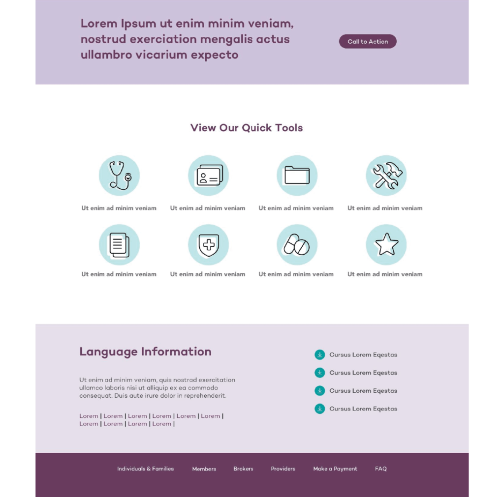
Iconography
I designed a set of icons aligned with the redesign and new style of the brand.
Establishing a bond between the healthcare industry and its costumers is crucial. But, when people need to take key decisions about their helthcare products, a feeling of uncertainty might emerge from these choices if they aren’t getting enough support from the existing digital platforms. We need Molina’s Marketplace to evoke empathic emotions and hospitality across their site navigation. To achieve it we have to apply humanistic design statements like casual wording, keywords, hand made illustrations, realistic photos, and soft shapes. Bringing the users a message of transparency driven by honest design.


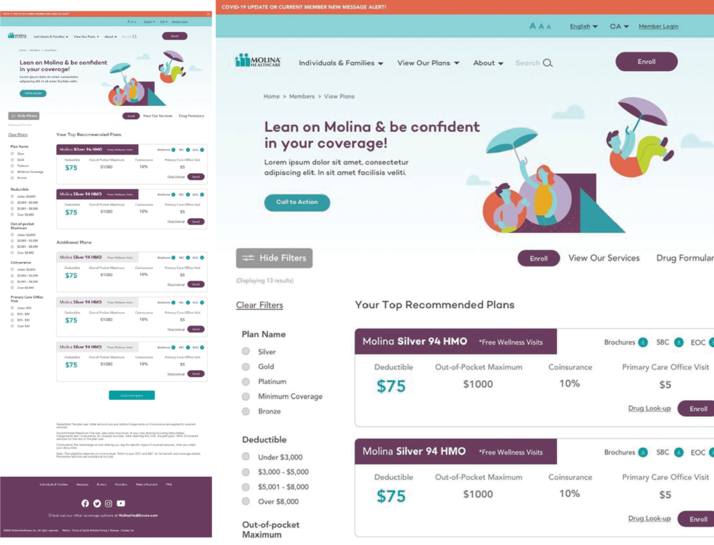
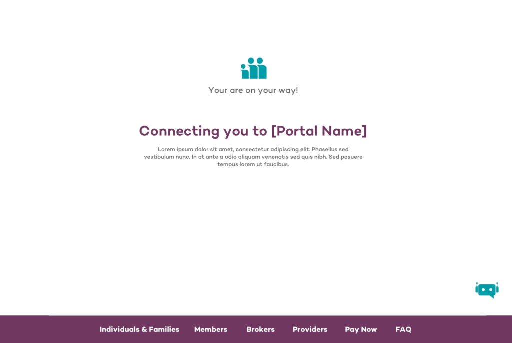
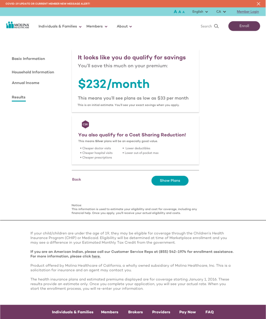
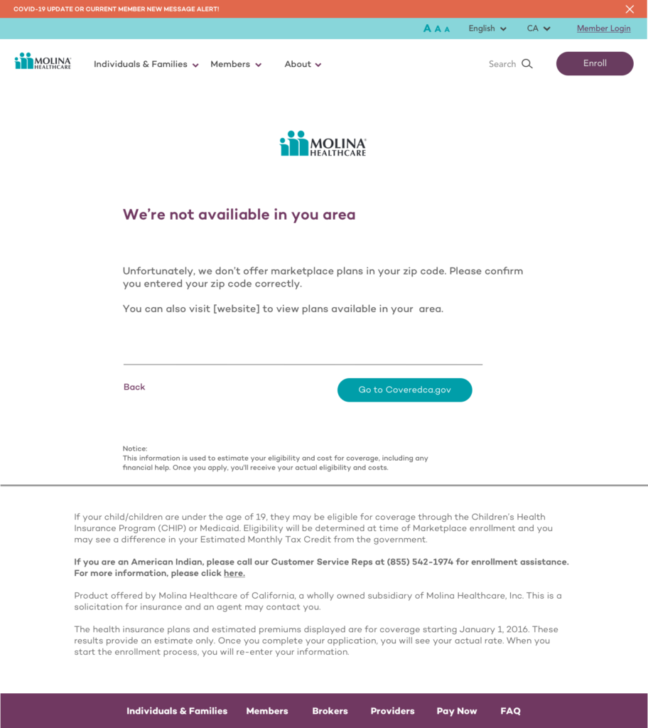
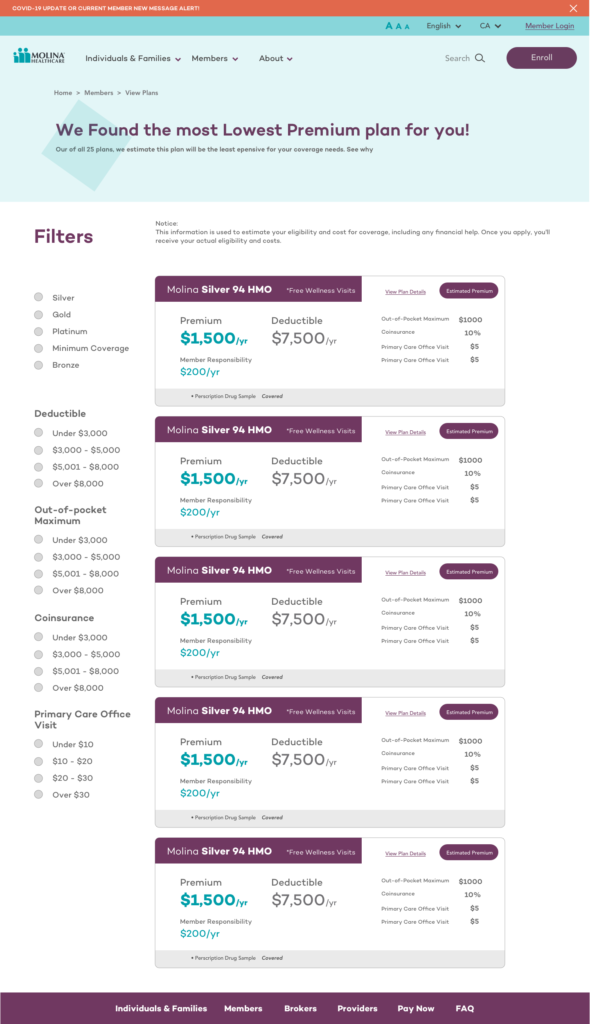
Premium Calculator
The project also included the development of a calculator where users can review which insurance plan best suits them according to the needs they provide.
People don’t like things they can’t understand. Consistency smoothens the learning curve of adaptability and easy interaction of an interface. While the client explores the site, its important to reassure them they are interacting within the same platform, so every element should be consistent to each other and aligned to the brand guidelines. This avoids frustration to users and facilitates them to recall how to navigate throughout the platform after subsequent visits, transmitting them a sense of control and familiarity.
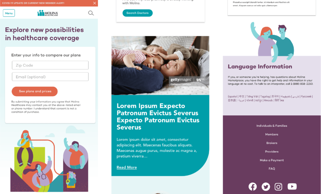
Mobile version
This is the mobile version design.We’re living in a digital world were mobile interactions are changing our digital consumption behaviors. Our devices know us well and fit into our lifestyle and activities. Adapting to current digital design patterns, Molina’s Marketplace can be driven by a mobile info consumption language instead of a traditional one opening a new scope of possibilities for usability tools and experience design.
This is the mobile version design.
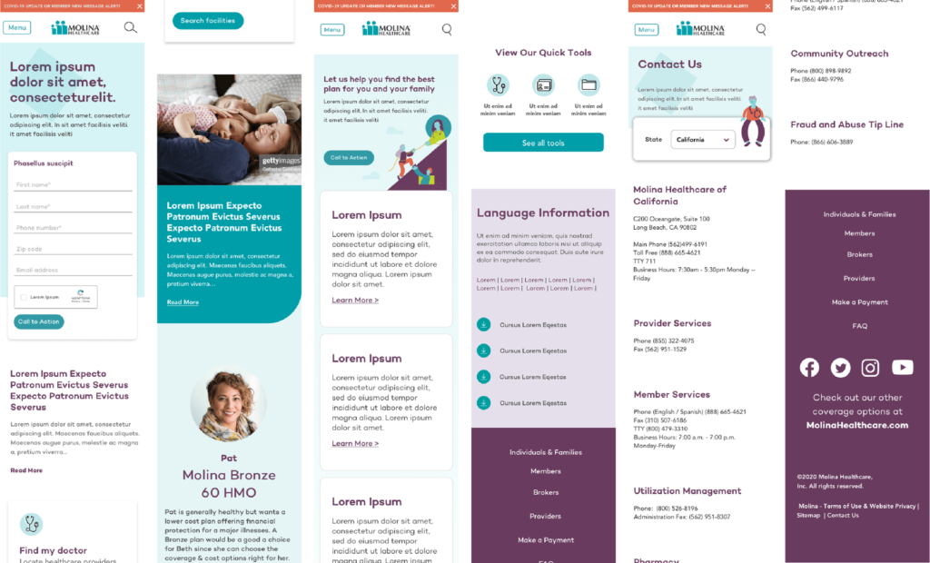
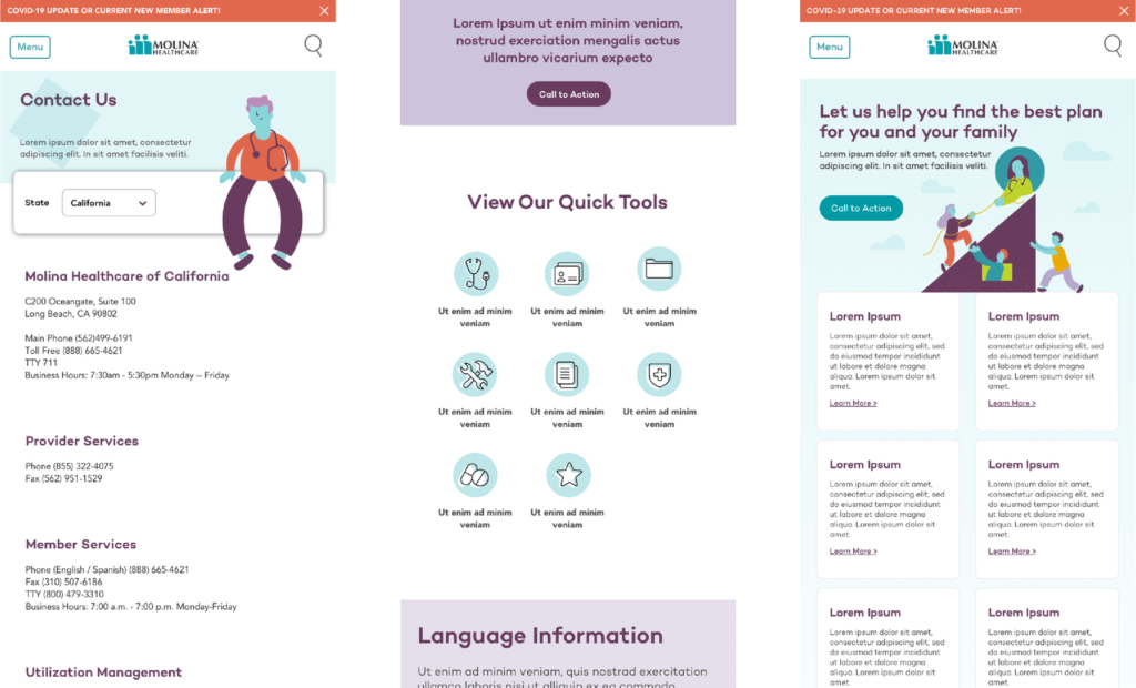
Tablet version
Molina Healthcare platforms should act as facilitators, focusing on enabling clients to solve their needs and goals, whether that is to acquire a service or learn more about their offerings. We should rank elements on Molina’s Marketplace website based on its business objectives in order to prioritize a clear content structure. Displaying an optimized interface along with an organized design and strategic content architecture guarantees that every component in it has a meaning and serves a purpose planned for easy navigation and task completion.
This is the tablet version design.