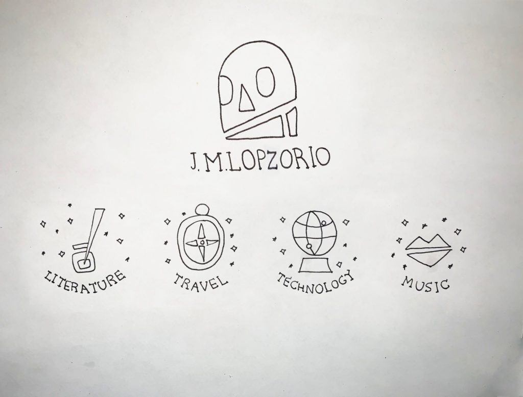
J. M. Lopzorio is the pseudonym of a creative writer of fantasy novels who is about to publish his work and needed a personal brand identity to use in his publications.
As inspiration for this project, the concepts of death such as festivity, the skulls, the mystical, mysterious, the concept of light, colors and darkness were explored.
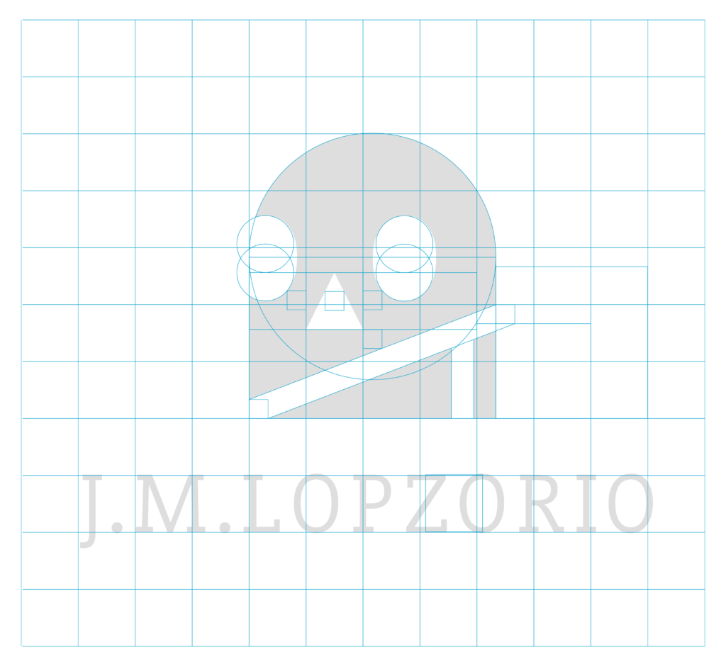
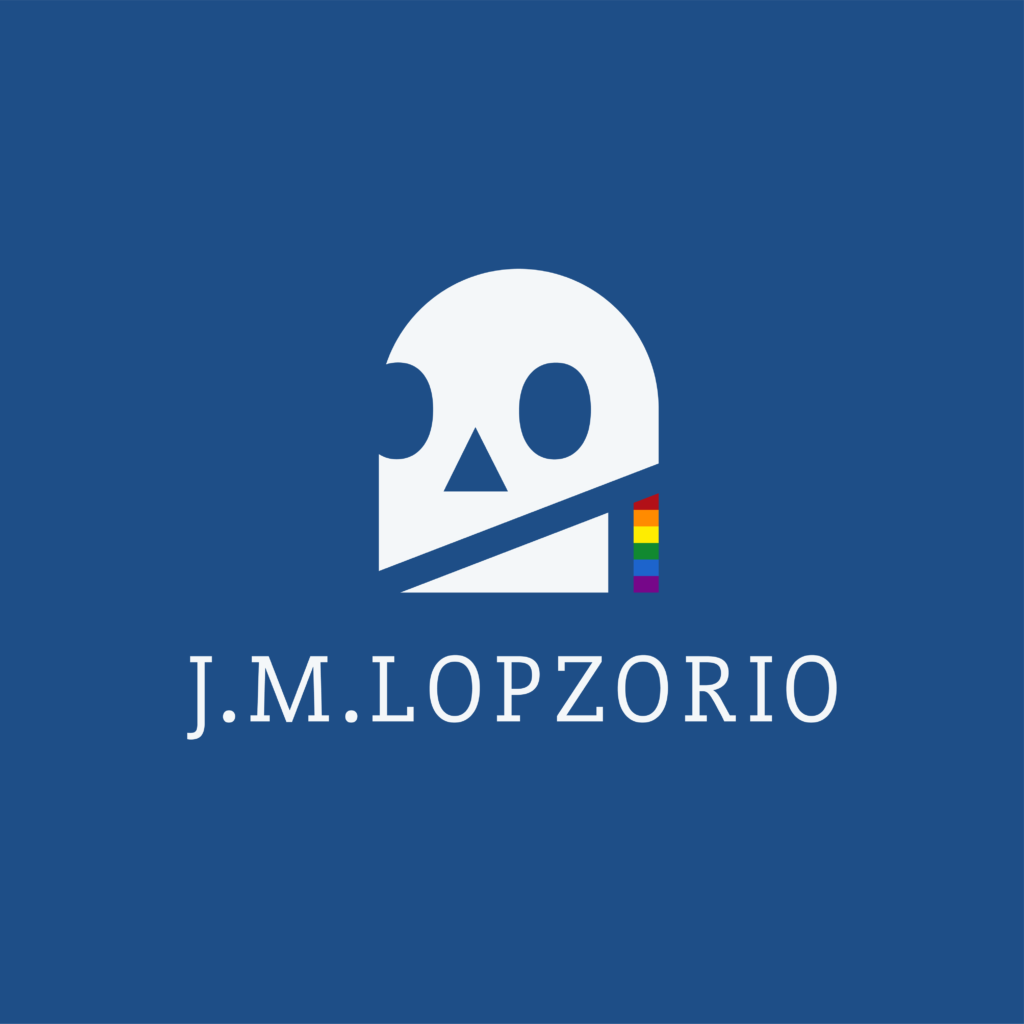
The proposal consists of a symbol with the abstraction of a skull in its simplest geometric forms.
The triangle that forms the jaw serves as the union of the analogy of the prism and the decomposition of light. Creating the eparation and showing the rainbow colors that in turn make reference to the iconic pride flag. For the logo is proposed the use of a serif font in all caps, projecting professionalism and seriousness.
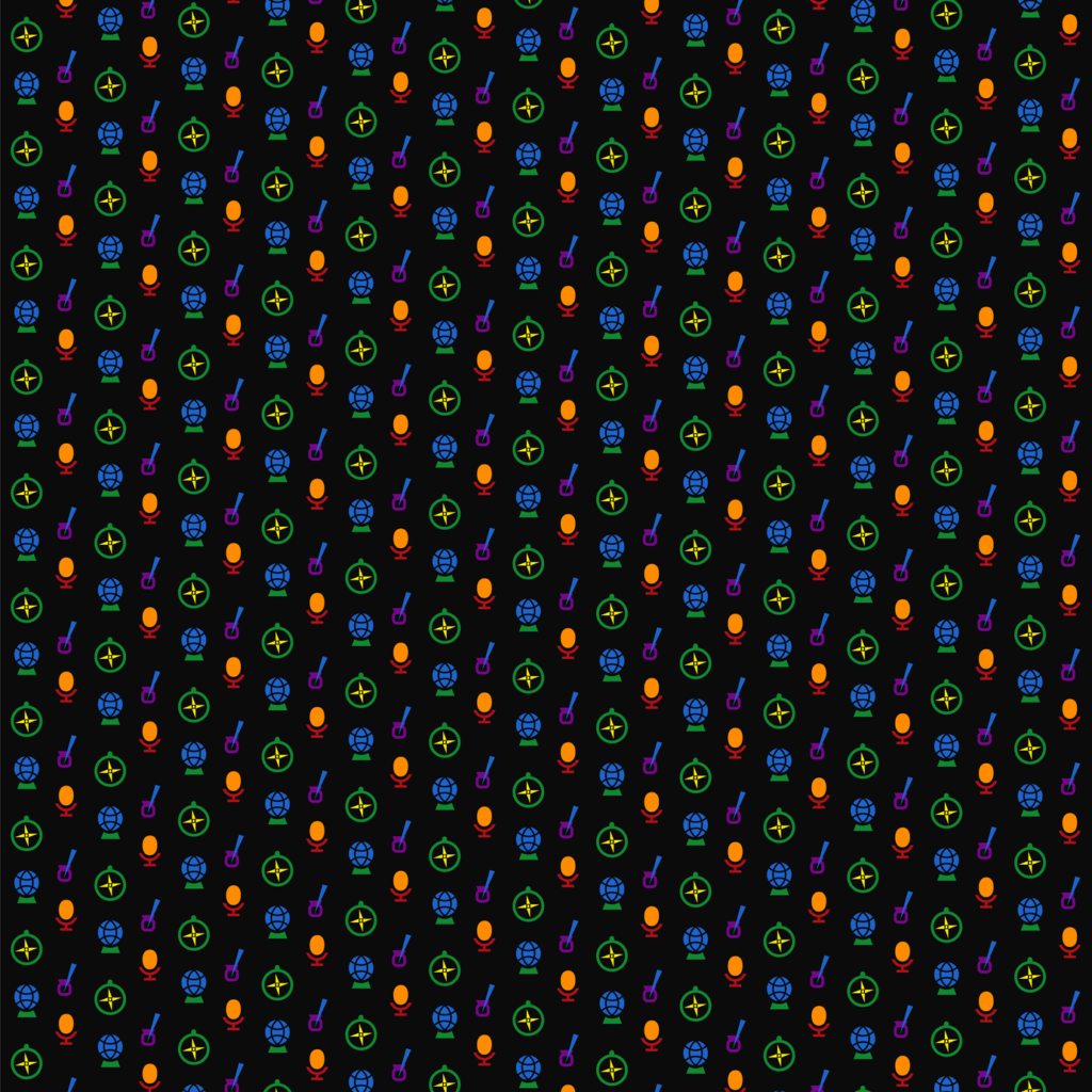
As part of the project, a series of icons were developed for each of the areas that comprise the brand; Literature, Travel, Technology and Music.
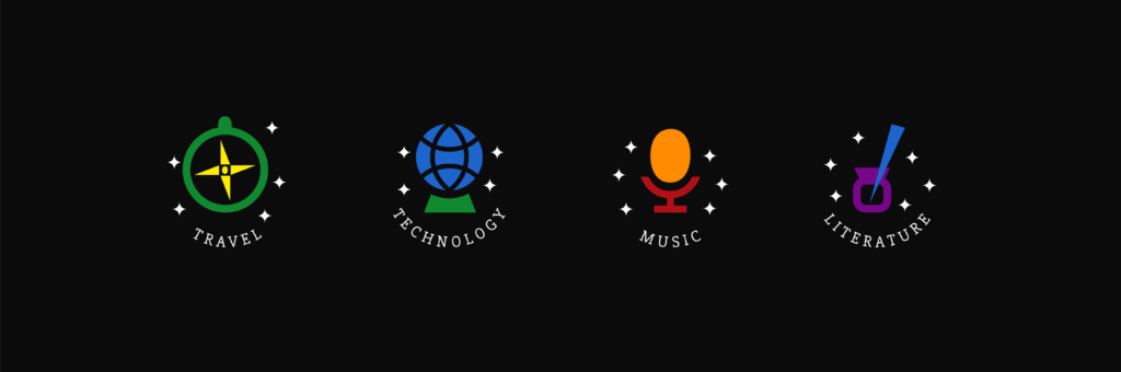
Each element is designed under the same minimalist line of reducing them to their minimum expression with geometric figures.
In turn, each concept will be represented by subsequent rainbow colors, thus linking through color, symbol and their icons. These icons together will form a pattern or texture that will accompany branding.
According to the Psychology of Forms, the triangle can represent inspiring qualities or a way of transcending as a metaphor. For this reason, the figure is implemented in all the elements of the brand in different ways.