
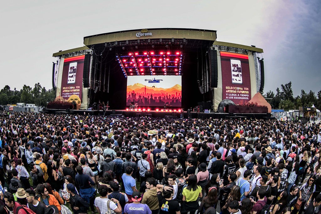
Corona Capital 2019.
All of us who have attended a music festival know that time organization is the key to make the most out of the event and to be able to see as many possible artists since in many occasions you have to run from one stage to another in order to enjoy bands that are playing simultaneously. But what happens when the festival itself fails to provide the public with the graphic tools needed to have this organization?
As a designer, I’m always looking for new ways to exemplify to people outside my industry the wide applications of design beyond “making things pretty”. Not to mention the mandatory conversation where many assume that design is art or when an opinion about a “good design” revolves merely on the — subjectively — aesthetic.
That is why I get very excited every time I find a Case Study where users can clearly identify the flaws of design at functionality level. This intrinsic attribute when applied correctly, is imperceptible. On the contrary, when a design lacks functionality, it’s impossible not to notice it.
This is when the debate gets interesting among users and designers as the true impact of what really is a “good design” turns evident.
Within one of my personal favorite Case Study to illustrate this point is the schedule of the Corona Capital music festival in its 2019 edition.
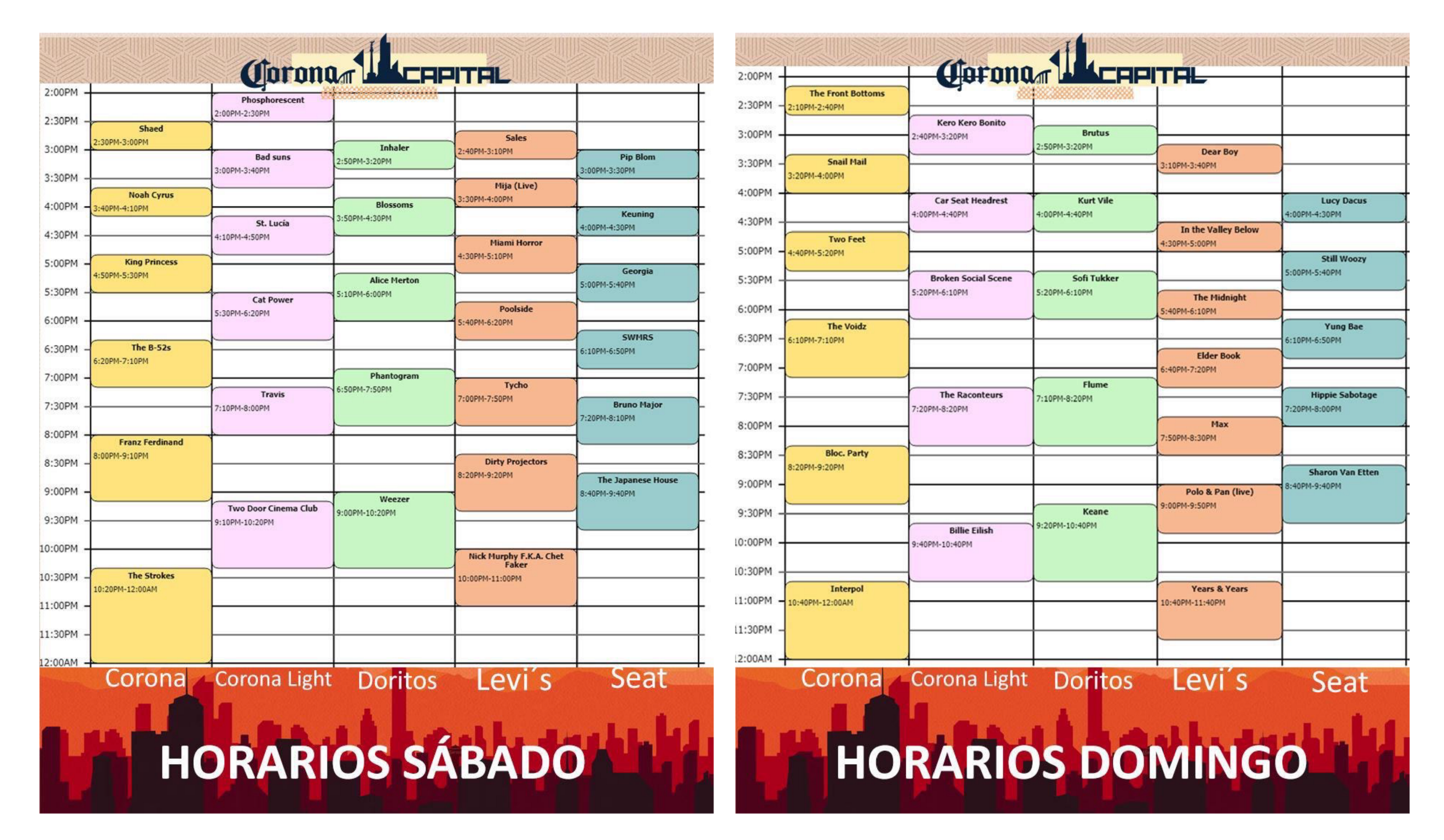
Just to give you some context, this event is considered one of the most important festivals in all Latin America, gathering more than 40 artists of international stature in its latest edition and in 2017 entering the list of the festivals with the most tickets sold, along with other top level events like Coachella and Lallopalooza Brazil.
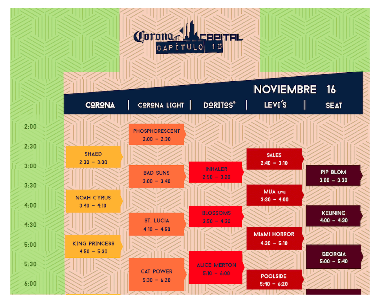
You may think that such a prestigious event comes with a design to the level, but it was not the case in the field of Data Visualization for this festival’s tenth edition. The official branded images the event used to show the artists’ schedules during the 2 days of the festival, created confusion for the public because they were difficult to interpret.
Next, I present the images that were disseminated on the official website and social networks of the event and expose in detail the visual errors of the design.
Texture
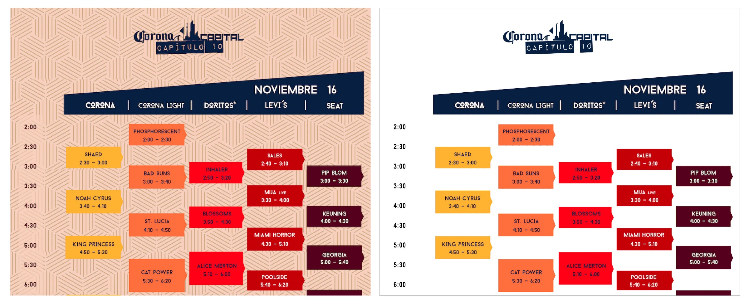
This is the zoom in of day 1 of the event. The left image is the official one, with a heavy texture as background, making reading difficult. In the right image I removed the background for explanatory practical purposes .
As a first impression, the schedule is quite difficult to navigate due to the poor choice of using a heavy textured pattern as background. This makes reading difficult because, instead of helping to highlight the information, it mixes with the background and generates visual noise when creating connections between the stage, the group and the time at which it’s presented.
The advice is to opt for a smooth background of a light color or a texture that is not so protagonistic to give space to the truly important factor in the image, the information.
As a user, we continue with our visual navigation to determine what our agenda will be at the festival. This is how we focus our attention on the text boxes with the groups that interest us and begin to form in our head an idea of the schedule that we should follow.
But while we are doing it we can notice that this exercise becomes particularly difficult with the image and that is due to the following functionality errors.
For practical purposes I removed the texture from the background to make the following explanations easier to read.
Proportion
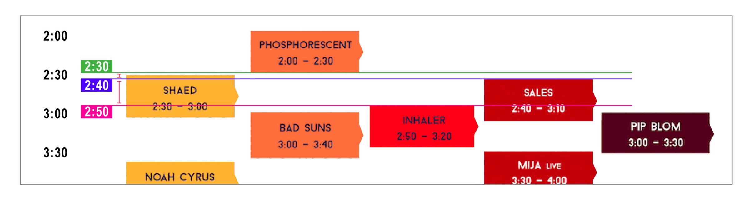
Here you can clearly identify the inconsistent proportions of what they represent as “10 minutes.”
One of the most significant flaws in this design is the lack of use in the proportions of the elements. In the image below, I pointed out the final performance time of Phosphorescent band (green line) and the beginning of the group Sales (purple line) and Inhaler (pink line). Each mark is separated by 10 minutes difference, however, visually this is not represented in a concise way as text boxes have notorious distances with irregular sizes (vertical red markings).
Such a visual error can confuse the user by making them believe that a presentation starts at the wrong time, ruining the mental plan that was created for the day’s agenda at the festival. The design here fails in its mission to present the information in a clear and easy way to consume.
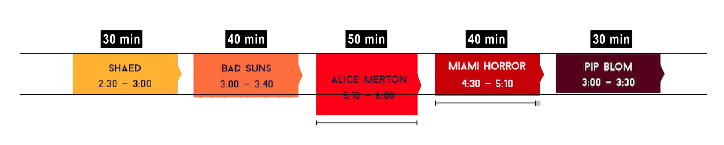
Second example of how the Ratio is not being respected in the design.
If we isolate the text boxes with the groups, we can identify that the sizes from both wide and high are not consistent. The design in this case does not respect the proportions. We can see how the group Shaed and Pip Blom, which their presentations are marked with the same duration of 30 minutes, they are not represented with the same size. The same with Bad Suns and Miami Horror, with a duration of 40 minutes. In the case of Alice Merton, with a 50 minute show, we can see a considerable increase in size in the height of the box, but this proportion is not respected throughout the design.
The advice is that, if you are going to use “size” as a tool for time identification, you must keep the proportions within the entire design. Otherwise the representation of this element is not going to mean anything because the same parameters are not being used at all.
Hierarchy

The Corona Light stage is represented smaller in the design, although this is the main stage. More important than that of Doritos, Levi’s and Seat who have a larger visual size in the schedule.
There is a phrase that I like very much that says “If everything is important, nothing is important”. I always keep it in mind when designing as a reminder of the use of differentiation in hierarchies.
There are several visual tools to make this distinction. By means of colour, size, position, in typography is the thickness of the text, use of capital letters, etc.
All these tools facilitate reading and visual interpretation. This specific design lacks this since it presents us of the same size and all in capital letters the name of the band and the timetable to be presented in the text box as well as the broken down schedules on the left side. Here it fails to mark that distinction, and does not guide the user within its visual navigation to interpret the information in a simple way.
Another hierarchy flaw is found in the scenario names, where you can see that their sizes do not visually represent their level of importance as the Corona and Corona Light scenario were the main and most important but in the design this is not reflected in comparison to the others.
By using the hierarchy distinction tools, it facilitates the reading and identification of the most important elements in this design.
Color

Using the same range of colors makes it difficult to read and distinguish. Especially in printed media.
The flaw in the element of color, although noticeable in digital format, has a greater prominence in its printed representation. Because text boxes are within the same color range, it makes it difficult to distinguish them. This is in addition to the background tone that we had been omitting for practical purposes from this article.
The advice in this design is to have a better choice of opposite colors when necessary and complementary for subtle highlights.
Layout
The green area represents the poorly used spaces of the design.
When a design is heavily loaded with information, the best practices for good distribution of spaces becomes key. This is to ensure that all data fits in the workspace and at the same time it can be readable to the audience. Here is where layout design is applied, to make sure every space is used to its fullest.
In the upper image marked with green, you can see how the design lacks a good layout as much work area is wasted on the sides of the logo and in the timetable area. Applying a good design architecture, it could have taken better use of the space and thus be able to increase the size of the typography or even experiment with the hierarchies.
The unnecessary elements create visual noise and contribute to misused space.
The advice is that although air and white spaces are essential to achieve a balance with the information, we must be very conscious of how we use them to make the most of the given area.
Creative copy

The green area represents the creative copy that can be improved.
By this point we have already scanned the image and identify different visual errors within the design. Graphic details, that if modified, can help enormously to the reading and understanding of the information. But there is still one more tool that can help us convey our message in a better way, and this is the creative copy or text.
Take for example the time lapse schedule on the left (marked in green). This element becomes useless because it doesn’t have a visual link to the text boxes with the bands on the right. Instead of helping us to better interpret the message, it forces the user to visualize a horizontal line to connect with a text box —that already has erroneous proportions — .
This exercise becomes doubly complicated with the Seat (purple) stage bands because they are the furthest from the schedule. By the time your visual navigation reaches these text boxes, you will surely have lost the exact visual relationship with the schedule, which makes you look back at this first point.
This not to mention the difficulties of having a busy background texture as the one from the official design. The key is to avoid any element that does not give some benefit to the design, but keep enough to represent the message effectively.
My advice is to include the breakdown of hours on the right side as well, to help the user make a faster relationship with the bands playing. Another tip is to include the day of the week of the schedule you are viewing. It will always be easier for the user to make identification by the weekly day (Saturday) than the numerical day (16). Remember that our job is to make reading easier for the user.
The response from the audience
Design proposaed by a user on Twitter with a more legible version of the schedule.
As a result of the confusion created by this poor representation of the schedule, different versions of the schedule corrected by the same audience, started circulating online. These alternate versions, although with room for improvement, are already much more readable and accurate than the original design.
The version shown at the top was created by a Twitter user. This design features corrected proportions and distinction in font and hierarchy of text boxes. We can also observe that “Saturday” and “Sunday” were used to differentiate one schedule from another, in contrast to the original version that uses “November 16” and “November 17”.
The error here is from Corona Capital festival, in making the user work on something that should be given by the brand.
The optimal thing is that each visual element is designed to facilitate the organization and reading of the audience, projecting the desired message in the most efficient way possible.
My take on it

The left side shows the original branded image. On the right side is my design proposal with the applied observations.
If you are going to criticize, you should propose, that is why this Case Study would not be complete without my revised version of the design (top image on the right side).
For my proposal I respected the essence of the original design as it’s the official identity of the festival, but I made some tweaks to facilitate the reading and understanding of the information. Remember that the ultimate goal of the design is to inform the user in the most efficient and clear way.
I took into account all the previously mentioned details concerning
- Texture: Subtly included in the upper right corner, in less prominent colors so as not to interfere with the reading of the text
- Proportion: The size of the height of the text boxes correspond to the duration of each group. The size of the width is consistent throughout the design
- Hierarchy: The typographic treatment that was used goes according to the information hierarchy, creating a clear distinction of sizes to provide differentiation of importance
- Color: Although I respected the basic colors of the original design, I modified the shades and the background color a little to help highlight the schedule information
- Layout: The distribution of information is more balanced. Having enough air and white spaces but, at the same time making good use of the work area, managing to increase the size of certain key elements
- Creative Copy: I included the day (Saturday) at the top for a faster identification, the breakdown of the schedule on the right side for easy reading and I deleted the copy showing the “half hours” (2:30, 3:30, 4:30) to have a cleaner design. Instead, I included dotted lines crossing the schedule from left to right to make visual navigation easier
Overall, if we apply all of the mentioned details, we would create a “good design”, that is, a much more efficient one.
Conclusion
Data Visualization es la representación de la información de una manera fácil de entender y que proporcione valor al usuario, diseñada específicamente para ayudarnos a hacer un mejor uso de la información.
De este Caso de Estudio podemos concluir la importancia de Data Visualization, el uso de buenas prácticas en diseño y cómo es que el conjunto de diversas herramientas visuales pueden ayudar al público a tener una mejor experiencia a la hora de leer e interpretar el horario de su festival favorito. Porque como mencioné al principio, la buena organización de tiempo es clave para aprovechar al máximo el evento y lograr ver tantos artistas posibles.
También, espero haber proporcionado puntos importantes para que la próxima vez que se enfrenten a un debate sobre si un diseño es “bueno” o no, puedan basar sus argumentos desde el lado funcional y no tanto del estético.
Para finalizar, les dejo una frase muy certera del gurú de Data Viz, que recomiendo tener siempre en mente a la hora de diseñar y ejercer una opinión sobre diseño.
“Graphical excellence is that which gives to the viewer the greatest number of ideas in the shortest time with the least ink in the smallest space.”
― Edward R. Tufte, The Visual Display of Quantitative Information